Over the past year or so here, we’ve tried to make front-end development less painful by creating living style guides in our Drupal themes that we can use internally as a valuable resource during development, as well as externally as a client deliverable. They allow us to write consistent, reusable and efficient code that is easy to maintain over the lifespan of a project. In addition, they show our design standards and prototypes that we can play with in a browser, at different sizes and in mobile devices, before things are truly functional and placed on an actual page of the site.
Though it takes more work at the beginning to set up, it definitely pays off in the long run. Ready to make an automated, living style guide work within your Drupal theme? Here’s how:

Using KSS and Grunt together to build a living style guide
Knyle Style Sheets (KSS) allows us to add special code comments to our Sass/CSS to specify the site’s repeated patterns, branding, color palette, typography, components and Drupal blocks/panel panes. When the Sass is saved and compiled it gets generated into a nice and clean style guide via kss-node (the NodeJS implementation of KSS), immediately viewable in your web browser. If you don’t like how the default style guide looks, you can customize things with KSS Node Template or just customize the default, vanilla style guide template. (However, recent improvements in kss-node – like being able to specify markup or a template file for everything that gets compiled into the style guide – have made KSS Node Template less useful for us.)
Grunt tasks have been great for us, helping automate some of the stuff we regularly do manually. For example, updating the style guide files the moment that there’s a saved change to the Sass files we’re working on:
watch: {
 css: {
  // Here we'll config grunt-contrib-watch to keep an eye on any .scss file, in any directory in the theme.
  files: ['**/*.scss'],
  // When one is changed and saved, let's run the sass task to compile CSS.
  tasks: ['sass:dev']
 }
},
things get turned into CSS…
sass: {
 dev: {
  options: {
   // Since we're compiling a "dev" version of the CSS here, let's make it expanded output style so we get all the little helpful references to where the CSS originates from in the Sass.
   outputStyle: 'expanded',
  },
  files: {
   // Advomatic standard practice is to have one single manifest file (styles.scss) where we import various partial Sass files in the order we want them compiled. We'll specify Sass to compile CSS exactly where we want it, in this case... css/styles.css.
   'css/styles.css': 'sass/styles.scss'
  },
 },
},
and then the style guide gets regenerated on the fly.
kss: {
 options: {
  // Link to previously compiled CSS.
  css: '/sites/all/themes/custom/mythemename/css/styles.css',
  // Link to theme JS.
  js: '/sites/all/themes/custom/mythemename/js/script.js',
  // Set our custom template to build styleguide from.
  template: 'mythemename-styleguide-template'
 },
 dist: {
  files: {
   // "styleguide" is the destination directory, the source directory is "sass"
   'styleguide': ['sass']
   }
  }
}
With this setup in the Gruntfile.js in your theme directory, you can view your style guide directly in your browser by viewing http://mydomainname.com/sites/all/themes/custom/mythemename/styleguide. That’s kind of a long URL, but we can make it more digestible by setting up a redirect to point that long path to a shorter path, like http://mydomainname.com/styleguide.
Drupal markup examples
You know them, you love them! Drupal has a bunch of “pieces” that you usually have to style on every site you work on; tabs, error messages, pagers – that kind of thing. A great way to see all the different stuff that could appear in your Drupal site is to download and install the styleguide module (check out this demo site to see it in action). You might not want all of that stuff in your KSS style guide, so just pick and choose the stuff you do want to use. For adding more standard, non-Drupal-specific HTML elements and design patterns to your style guide, Brett Jankford’s Style Guide Boilerplate is an excellent source of markup chunks.
Let’s say you want to add the Drupal pager to your style guide.
The latest version of kss-node allows you to specify a file containing a markup example template file (either .html or .hbs) for each section of your style guide. You can then copy the default pager markup that gets rendered from the styleguide module’s page for your theme at at http://mydomainname.com/admin/appearance/styleguide, and stick it into a pager.html file in your theme and tell KSS where to find it via the KSS comments in your Sass, like so:
// Pager
//
// Markup: pager.html
//
// Styleguide: pager
After you compile your style guide, you will find a “Pager” section that has a prototype (non-functional) pager example using the markup in the pager.html file you added. You can then style that example as you wish. Note: the filename should be relative to the .scss file you’re specifying it from.
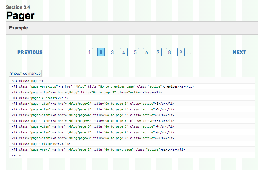
Pager example within the KSS styleguide, as well as a background grid (via Susy)
In conclusion
This is just a brief overview of how to make an automated KSS/Grunt living style guide work within your Drupal theme, and there are even more ways to make your it more organized and comprehensive. We have definitely found that a little work setting up a living style guide during your initial theme setup goes a long way during the project. The result is a constantly updated library of default styles, patterns and prototypes (with markup examples) that serves as a valuable team and client resource.
For an excellent overview on the resources for building (as well as the benefits of) living style guides, you must read my fellow Advomatic front-ender Amanda Luker‘s excellent recent post.
You should also check out:
- Design for Drupal 2014: A Recap
- This is the House That Jack Themed
- Streamlining Your Design Workflow
- A Quick Guide to Free Stuff (Well, Images and Fonts) on the Internet
- Not Getting Great Client Feedback? Here’s How You Can Help