Nonprofit websites, just like the organizations behind them, vary in mission, size, and complexity. But almost every nonprofit’s website has one goal in common: it aims to make donating online easy. For some organizations, this might even be the website’s most important job.
Here are four ways to ensure that your website’s visitors who are motivated to give don’t get lost along the way.
Don’t be subtle.
Website designers (particularly those with little or no experience designing nonprofit websites) sometimes resist making the donation button stand out. They often consider the donate call-to-action one of many elements in the navigation- not one of its most important features. As a result, it blends in with other features and can be harder to notice, or it’s buried in secondary or footer navigation elements.
I get it. A more subtle donation button looks pretty.
But it doesn’t work.
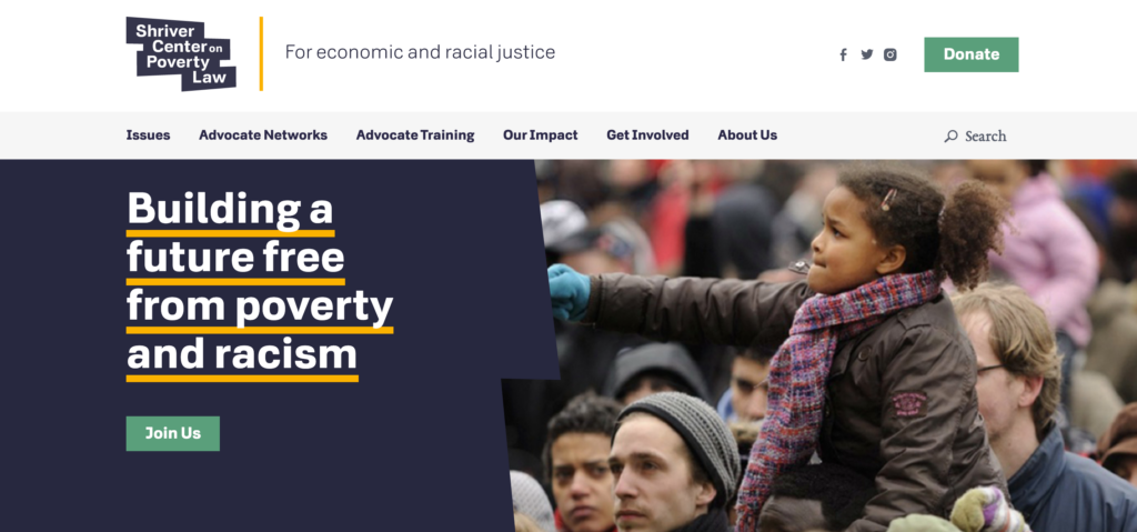
Great design and a less-than-subtle donation button don’t have to be treated as conflicting agendas. The Shriver Center on Poverty Law’s website, for example, uses a bold green donate button in an expanse of white space to draw your eye, combining great design and a direct call-to-action.
The donation button is a utility item designed to spark a very clear, important, and specific action, so it needs to be eye-catching. Do this by:
- Placing the button in a location that can’t be missed (typically within the main navigation or on the top right of all pages).
- Using a contrasting color or other design element that helps it stand out so your eye is drawn to it.
- Using language that’s clear and direct—like “donate” or “donate now”.
Over the past 25 years, countless nonprofits have tested different sizes, shapes, designs, and locations for the donation button—and a lot has been written on this topic. If you’re working with a web designer with less experience in nonprofit website design, consider sending them this article or others that align with your goals and perspective.
Don’t bury the ask.
There are a number of reasons why nonprofits bury the appeal for a donation on their website. Some have a cultural aversion to asking for money. Others don’t prioritize the experience prospects and donors have online. Some overcomplicate by adding layers of details or pages you have to get through before visitors can donate.
To make sure you aren’t burying the ask, ask yourself these questions:
- Can your donor make a gift without a lot of clicks? Ideally in one click?
- If you click on the donate button are you taken to a secure page where visitors can complete a form and make a gift right away?
- Is it easy to find the donate button on every page of the website, no matter where you are?
- Are you using language that makes it clear what you are asking for?
Some organizations use language like “take action” instead of “donate now”. That’s great if your goal is to get visitors to sign a pledge or write their elected officials, but it can feel like a bait-and-switch if it leads to a donation landing page, or if the donor has to wade through lots of sub-nav or secondary pages to get to the donation form. Try to avoid less direct language and layers of pages between the button and the donation form. Try using “donate” or “give” rather than verbs like “support” or “act”, which can mean a lot of different things.
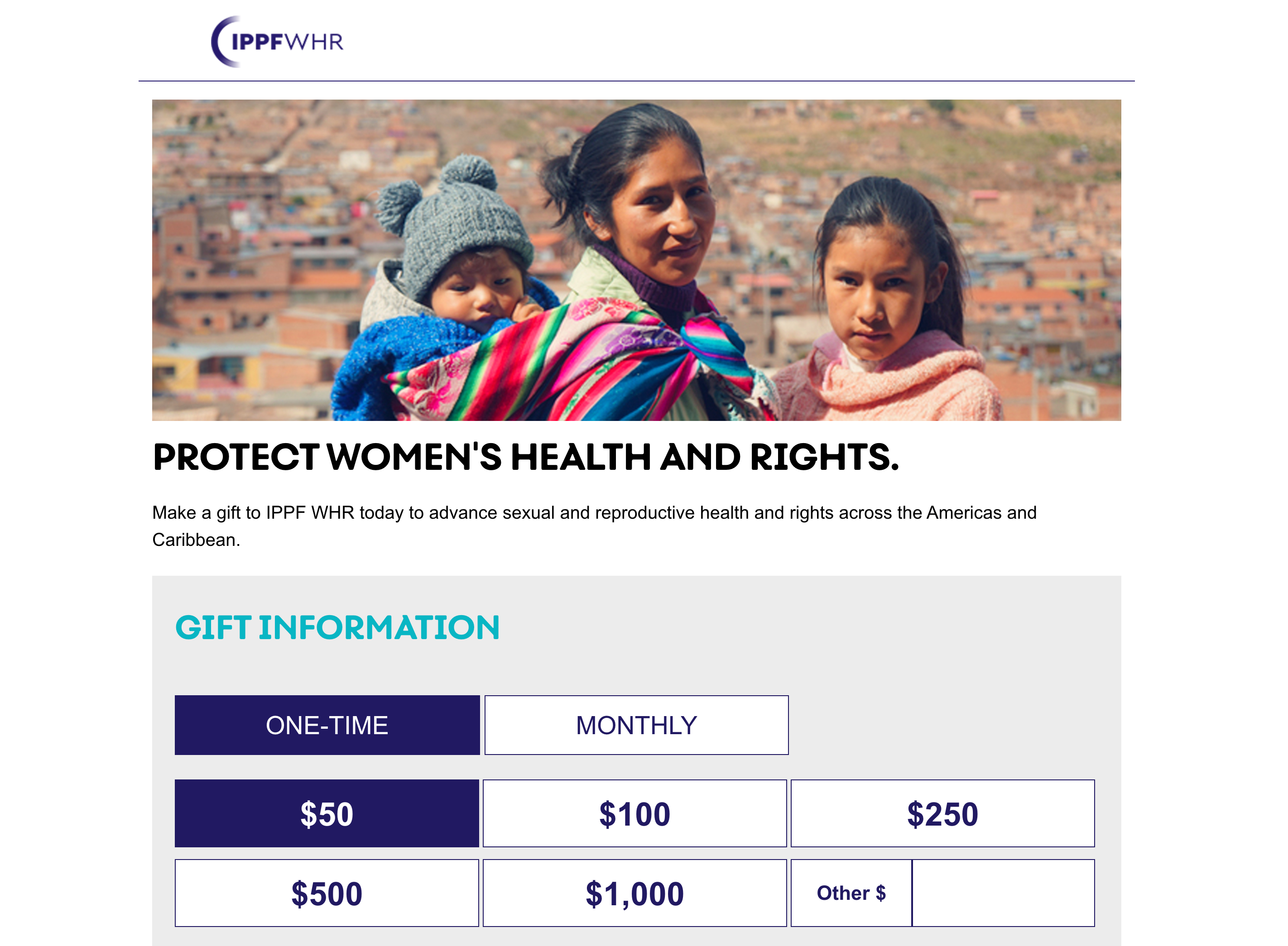
Bonus points if this page also makes it easy to give on a monthly basis or integrates an easy to use employer matching program, like International Planned Parenthood Federation Western Hemisphere Region’s donation page.
Don’t overcomplicate it.
Matching gifts, sustainer programs, planned giving, memorials, gifts in honor… there are lots of ways to customize how donors give to your organization. Some fundraisers will want to make sure all the options are front-and-center—but when you prioritize everything you often end up prioritizing nothing.
Make it easy to submit a donor’s basic information and giving amount first and foremost. Customize the ask string based on their past giving and pre-populate any fields with the information you’ve already got on file, if possible. Keep all other options simple and focused on what your fundraising team knows is most successful. Try to avoid layering in too many questions or options on the primary donation landing page as you risk overwhelming and potentially losing the gift altogether.
Still want to tell them about your planned giving program or other ways to get involved? Link to these options in sidebars or smaller copy that doesn’t distract them from the task-at-hand: making a gift now.
Don’t give them a reason to walk away.
Fundraisers and communications experts in nonprofits work hard to inspire folks to visit the website and give—and the website’s job is to ensure that, once they arrive, it’s a fast, easy, and painless process. User testing can help surface barriers or frustration points you aren’t aware of.
Here are three simple ways you can reduce the likelihood someone will abandon your online donation form pages:
- Make sure form pages are secure. Protecting your donor’s data security is an obligation—not an option. Donors must feel confident in your website’s security and privacy practices when sharing their personal data and payment information.
- Optimize your donation landing pages for mobile. The data shows that people really do donate—and do all sorts of other things—on their phones.
- Accept all the standard preferred payment methods. That means accepting a range of credit cards, PayPal, and mobile payment methods such as Apple Pay and Google Pay.
Consider conducting an annual audit of your website’s giving experience, including examining what happens to donors after they give online. Doing this in advance of big giving seasons will take relatively little effort and can pay large dividends over the long run.
Need help? Advomatic’s here! Drop us a line if you’re interested to hear more about our online donation audit services.