In my role here at Advomatic, doing Drupal Development, for the last two projects I’ve worked on, I’ve gotten requests for a surprisingly tedious layout that looks a little like this:
It’s a grid of images with captions of varying length. Now, this would be a cinch with tables, I prefer to handle these with pure CSS. (Tables are great for data and charts, but I don’t like to use them for layout.)
So, at first blush, it seems you just float each group (image & text) to the left and be done with it. However, the caption length poses a problem. How do all groups on a row know the tallest height for the next row to clear? The solution to this problem is the temperamental display: inline-block; declaration. However, it requires some taming to work across all browsers. In this post, I’ll outline the process of setting this up specifically with a Drupal view.
1. Create your gallery view, making sure that:
- Basic settings -> Style is set to Unformatted (both Grid and Table result in HTML tables)
- Basic settings -> Row style is set to Fields
- Under Fields, you have added an image field and a caption field. In my case, I made them both links to their full node. I’m also using an imagecache preset to change it to a thumbnail in this view.
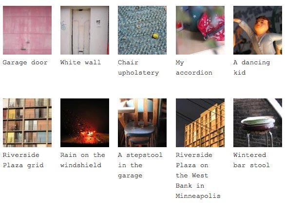
2. View your new gallery. (You may have declared a URL path for it in the view if you are making a Page view.) Take a look at your HTML for each image + caption group. Mine looks a little like this:

Garage door
3. Add some CSS. Your first inclination might be just to float the group.
.view-inlineblock-test .views-row-odd,
 .view-inlineblock-test .views-row-even {
 width: 100px; /* set the width for each image/caption grouping to the width of the image */
 margin-bottom:10px; /* set a margin for beneath each item */
 margin-left:10px; /* and a margin to the left of each item */
 min-height:120px; /* and declare a minimum height */
 float:left; /* … and the float. */
 }
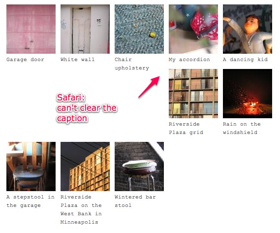
This actually looks OK in Firefox. However, when I open it in Safari, I get the dreaded stagger.
3. Let’s try the inline-block method. Inline-block is
.view-inlineblock-test .views-row-odd,
 .page-testing .view-inlineblock-test .views-row-even {
 display:inline-block;
 margin-bottom:10px;
 margin-left:10px;
 width: 100px;
 min-height:120px;
 }
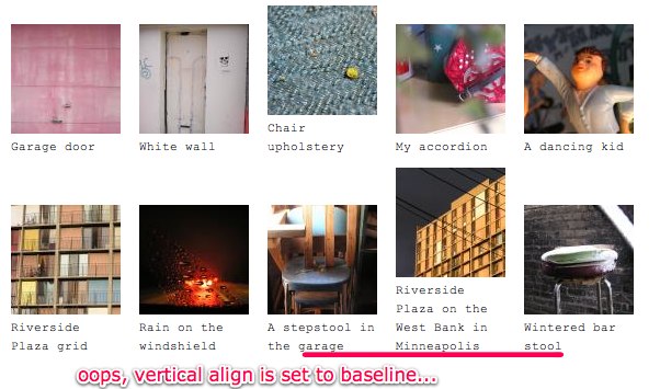
Whoops. The groups are clearing now, but they are also reacting to an inherited vertical-align: baseline. Let’s correct that with a vertical-align: top.
Cool. Looking good in Firefox and Safari.
4. Now let’s turn to Internet Explorer. Ugh. The image/caption groups are still in a single column.

IE doesn’t support inline-block, so to create the same effect, let’s trigger
hasLayout with zoom:1;. HasLayout is an Internet Explorer proprietary concept. It basically will bind the element it is applied to with its children so you can give it min-height, width and z-index, for example.
Then tell ONLY IE to display the image/caption group inline with the Star target hack. Also, add in a height declaration for IE 6 (with an IE underscore hack) since it doesn’t recognize min-height, but treats height the same way:
.view-inlineblock-test .views-row-odd,
 .view-inlineblock-test .views-row-even {
 display:inline-block;
 margin-bottom:10px;
 margin-left:10px;
 width: 100px;
 min-height:120px;
 _height: 120px;
 vertical-align: top;
 zoom:1;
 *display:inline;
 }
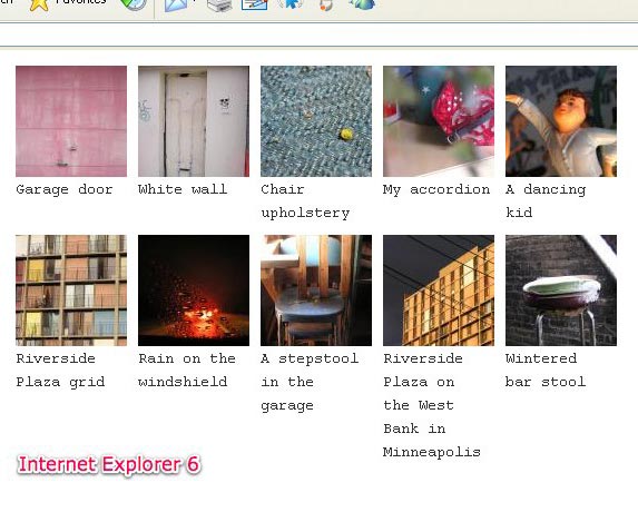
Nice. Looks right in IE7! Let’s check IE6. OK, looking good:
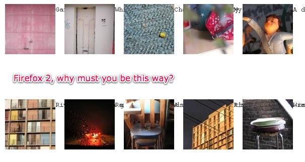
5. One more browser, saving the best for last: Firefox 2, which is still in rotation. After all this, it is kind of funny to say that FF 2 does not support inline-block. But it’s true. Firefox, however, does have a proprietary declaration that works: not display:-moz-inline-block; (which ironically does something else), but rather display: -moz-inline-box;. (In my original blog post I used the declaration -moz-inline-stack here, but as a commenter pointed out below, that will render links unclickable.)
Let’s add that at the top of the list so FF2 will get it and ignore the unsupported display: inline-block (and other browsers will have display:inline-block override the previous declaration):
.view-inlineblock-test .views-row-odd,
 .view-inlineblock-test .views-row-even {
 display: -moz-inline-box;
 display:inline-block;
 margin-bottom:10px;
 margin-left:10px;
 width: 100px;
 min-height:120px;
 _height: 120px;
 vertical-align: top;
 zoom:1;
 *display:inline;
 }
OK, that gets us one step forward, and one step back, as it were:
There’s a little fix for this, in which you wrap all your content directly inside the parent (the element you’ve given the –moz-inline-box declaration) with another div. Sounds easy, right? However, being a Drupal view, we will have to use a custom views template to add in that div.
Let’s go back to our View and find out exactly what template to use and where to put the new template.
Go to Theme: Information. Click the link for Style output. Copy the template code and paste it into a new file that you will name based on one of the suggestions Drupal views nicely provides for you. I chose views-view-unformatted--inlineblock-test.tpl.php because it will limit it to only that specific view, but there are several options to choose from.
In the template, find . This is the line that spits out each of your image/caption groups. So, around that you can add divs. For example:
. It doesn’t necessarily need a class, but I put it in to remind me what it was for!
Flush your caches and reload the page.
You’ll need one last bit to make it perfect in Firefox 2. Give your caption an explicit width, the same width as its container:
 .view-inlineblock-test .views-field-body {
 width:100px;
 }
Now we have a cross-browser compatible table-less gallery with images and captions. Yay!